Saturday, November 24, 2012

"Peace of Mind" 18x24 Pastel Progression

Here's a quick little post showing you the steps taken to create my painting "Peace of Mind." I really enjoyed working on this painting. It's another scene from the Goldtwhaite Trail in Danville, NH. I also enjoy working in a larger format...not sure why because it's time consuming and I'm very impatient. "Peace of Mind" was accepted into the Newburyport Art Association's Fall Juried Show which was a great feeling. I love this painting, I hope you enjoy my post. 


First I started with a quick block in of local color. Creating the form and composition of the creek, position of the trees and start with my base of purples and blues. As you can see from my snow scenes I really LOVE to use those purples...they give such a beautiful feel to the snow...

 Normally I would do an underpainting but this was my first time painting large on UArt paper and I was not sure how much tooth I would lose. I would under paint a small section a bit later...


Here I started to really form the snow...build up those colors, try to create some motion in the terrain. I started to form the trees as well as give the creek a more defined shape and direction. I worked from top to bottom and tried to stay away from the creek at this time. I also started to add some of the brush in the background...just to see where I could start adding some of the sunlight.


Here's a bit of a jump in the progress of this painting...As you can see I've added some more trees to the top and continued to layer on the colors. I've begun to create the form in the snow and give the terrain more warm and cool highlights. The trees were given more form as I began to bring the warm sun through the trees. I had to start the warm color now before I started to fill the background with the forest.

I also began to come in with some really cool blue greens to give a nice cool reflective sheen to the snow.

Here is where I added some alcohol to my creek to really dig the pastel in the tooth and give it a really dark base that the creek really needed. 


In this step I carried the form of the terrain across the top in the background and kept coming with the warm color reflecting off the snow. I gave the section on the right some shape and also added in the trunk to the main small tree to position where my trees will go. I started adding some color to the water and more shape to the snow where it meets the creek.


Here is the finished painting and another bit of a jump. Sorry with a painting this large, I have about 100 photos at different stages.

I've really layered in the trees in the background...giving them tons of color and creating the depth needed to bring this painting to life. I added some snow creeping up the trees and some really strong highlights in the background.

The water is flowing with lots of color and beautiful cool icy highlights...I really wanted you to feel like you were in the cold at this location.

I added the small flock of tiny trees on the right...essential for creating the perspective of the creek going off in the background. The curve of the branches really give it life.

I've also added my signature "rock" in the foreground on the left. I try to fit that rock into every snow scene I paint.


Thanks for reading, I hope you enjoyed my post.

-Jeff


Thursday, November 15, 2012

"Warm Winter Sun III" - Pastel 6x8


Here's a small pastel I painted last week for the Open Studio Tour. I love the depth in this painting...I really played with the colors, pushing the purples in the snow and adding some bright red splashes of color in the water. This will be going into the Holiday Show at the Newburyport Art Association next week. Stay tuned for more details.

Two quick things I want to mention...First, this painting is also from the Clyde Goldthwaite Trail in Danville, NH. One of my favorite places to paint. I have two more from this series I hope to finish soon. Second, this is my 100th post. Not that I receive an award for that, but it's kind of neat.

Thanks and see you soon! 

-Jeff

Monday, November 12, 2012

THANK YOU!

For everyone who came to visit me this weekend at the Open Studio Tour, thank you!!! We had some incredible weather and a great turnout! I was so proud to be a part of the event...I met some wonderful people who had such nice things to say...it really means a lot!

Stay tuned for more events to be posted soon as well as some images of my new work!

Thanks again and see you soon!

-Jeff

Tuesday, November 6, 2012

Artist Reception Friday!

Join me Friday evening at 5:30 for the Open Studio Tour at the Artists' Muse Studios in Amesbury! I will have a variety of paintings on display in both oil and pastel. There will be wine, hors d'oeuvres and fantastic art! I hope to see you there!!


Sunday, October 28, 2012

Weekly Photo

For those familiar with my work you will remember a few paintings I completed from subject matter the evening before Hurricane Irene. I always make sure I take a trip to the beach to see the surf. The waves, the water, the clouds are always spectacular...it never fails. Today I made sure I was up early enough to see the sunrise and it did not disappoint...amazing how you can feel something in the air during inclement weather.


View from my deck overlooking the woods of the Goldthwaite Trail. 
The subject of many of my snow scenes.

Had a field trip to Plum Island this afternoon and as impressive as the waves were, what was most impressive was the surge. The water was so high...I can't imagine what it will be like tomorrow. 


The sea spray was like rain...I had to clean my lens after every two shots.


Brutal wind...very hard to keep your footing. Very intimidating force even at this stage.


the penguins look a tad bit out of their element...

Any way...no sunset pics like Hurricane Irene, but still impressive. Hopefully the storm won't be too bad. 


Thank you!

I just wanted to say thank you to those who stopped by to say hello at the Newburyport Art Association last evening! It was a fun evening and the art looks fantastic!

If you did not have a chance to stop by the show will be available for your viewing pleasure until November 17th.

As I mentioned I had two paintings accepted...one of them being "7AM Bridge Street-Chatham" the other is a new painting I just completed. A large snow scene from the Goldthwaite Trail in Danville, NH.


"Peace of Mind" 18x24 Pastel

I will post some progression images of this painting soon! Stay tuned.

Saturday, October 27, 2012

ARTIST Reception tonight!

Join me tonight at the Newburyport Art Association from 7-9pm at the artist reception for the Fall Members Juried Show part 2! I had the honor of both of my submissions being accepted into the show. I will post those paintings soon...Stay tuned! I hope you can make it!

Tuesday, October 9, 2012

Save the Date - Amesbury Open Studio Tour!


Mark your calendars!

Join me at the Artists' Muse on November 10th and 11th for the 2012 Open Studio Tour! The artist reception is being held Friday, November 9th at 5:30pm. Stay tuned for more details!


Sunday, September 30, 2012

What a Day - THANK YOU!


"Humbling River"
9x12 Pastel
Parker River Wildlife Refuge - Newburyport, MA

I would like to thank everyone who stopped by to say hello at the Newburyport Art Association Artist Reception last night. Sadly I did not have time to stay for the entire evening, but did manage to make it for a short time...the most important part...Robin, received her award for Best In Show! Congratulations -so proud of you! 

Immediately after the award ceremony it was off to the Mission Oak Grill for the Wet Paint Auction. This was a loooonng day, but worth every minute. I was happy to have my painting sell at the auction and be able to help out the Newburyport Friends For Peace. Robin also finished a beautiful painting which also sold at the auction - congrats on that one too!

It was a very cold, windy and rainy but I managed to finish the painting above. The title is very appropriate...the conditions were extremely challenging. Much more than I anticipated. I'm happy with the end result. An extra special thank you to the person who purchased my painting. I'm happy it has found a nice home. Thank you!

Thursday, September 27, 2012

Please Join me!

A busy day in Newburyport!


"Beauty Before the Beast"
12x16 Oil
Newburyport, MA
On the eve of Hurricane Irene

Please join me this Saturday for a couple of great events!

First, I will be painting in the Newburyport Friends For Peace WET PAINT Auction
 to support diversity and tolerance issues in the city of Newburyport. Your art purchase will
 support the City of Newburyport’s Annual Peace Prizes and the community outreach programs.

 For those of you not familiar with a wet paint event, I will paint outdoors beginning at 10am
 somewhere along the **Parker River wildlife Refuge in Newburyport, my painting must be completed  
 and hung no later than 4pm. The live auction will then begin at 6:30 pm.

 Come bid on some beautiful artwork while supporting a great cause!  the Auction is at
 Steeple Hall, Mission Oak Grill, 26 Green Street in Newburyport.

Second, I had two paintings accepted into the Newburyport Art Association's Fall Members Juried Show which runs from September 28 through October 20th. The artist Reception is Saturday from 7-9 pm.


Sunday, September 16, 2012

Updates and Reminders!

I just wanted to remind everyone about a couple of my current shows going on as we speak...

Right now at the Newburyport Art Association I have two paintings hanging at the Fall Members Open Show. The show runs until September 22.

I also have a dozen paintings hanging at Anna Jaques Hospital to benefit the hospital's Aid Association. 30% of your purchase will be donated to the Aid Association. The show will be hanging until September 27th.

The most amazing news was my acceptance in the Frances Roddy Competition at the Concord Art Association! This was quite a surprise. I literally decided last minute what to enter into the show only to find out a day later of its acceptance. Stay tuned, I will post the pic a bit later. The show runs until October 13th.

I hope you can find time to stop by one of the shows! Thanks for reading!

-Jeff

Tuesday, September 4, 2012

"Sunrise at Chatham Light" 4x4 Pastel


Chatham Light in Cape Cod

The Chatham sunrise I will never forget...

I finally got around to painting this pastel a year later from that beautiful morning in Cape Cod during Robin's Plein Air Workshop last fall. It's very challenging working in that size, but I really enjoy it. I'm very happy with this painting....I feel I really captured that amazing orange glow from the sunrise that morning. It now has a wonderful home and will always be a reminder of that incredible day. 


Friday, August 31, 2012

Anna Jaques Hospital


"Sandy Point" 12x16 Pastel

From August 30th through September 27th you can check out my work hanging at Anna Jaques Hospital to benefit the AJ Aid Association.  You can see this painting and about a dozen more hanging there for the next month. 30% of your purchase will be donated to this great cause. It's such a wonderful feeling knowing my work can bring a smile to the face of someone during a time of need. 

I hope you will have time to stop by and take a look. Thanks!

Saturday, August 25, 2012

"Beach Day" 6x8 Pastel


Here's my latest pastel entitled "Beach Day." (Thank you pumpkin ;-) 

I was working on a larger pastel when I needed a break so decided to work on a smaller pastel. I literally grabbed a board and a photo and painted this.

This painting is from Sandy Point at Plum Island across from Crane's Beach. A beautiful location. I painted the same location in pastel once before entitled "Sandy Point."

I love the colors, I love the sandy water. I love the perspective of the shore line. I love the tree line, I love the clouds...I guess I love the painting...I hope you do to!


Thursday, August 16, 2012

From Start to Finish - "Ocean's Thunder"

In my previous post I mentioned I would get around to posting the progression pictures of "Ocean's Thunder," so here you go!  Kick back, grab a nice drink and your laptop and enjoy!

I apologize right from the start...I photographed this painting so often my picture quality is very poor. Bad angles, poor lighting, the colors are off, glare on the canvas...so again, I apologize.


When I set out to paint this subject I wanted to accomplish four things...first, make the rocks look like rocks; second, make the splash look like a splash and not a cloud or something else; third, keep the underpainting showing thorough and lastly, finish the painting in a reasonable time frame. The painting was completed in about 5 weeks....lightspeed for me. OH sorry, five things...I wanted the perspective to really give you the effect of the rocks heading off into the background.

I started off by toning my canvas a dark maroon color. I think I used Alizarin Crimson and Raw Umber. I wanted to keep my underpainting showing through at the end. The colors are prominent throughout the rocks, so I felt if I could keep some of the dark color it would really accent their look in the end. As you can see, I hadn't even added the splash at this time. I just wanted to get the layout and position of the rocks in place since they are the most important part of the painting. 


At this stage I started adding some color to the rocks giving them some form. I also placed a quick block in of the splash using the same color to highlight some of the splash bubbles on the water to the left of the rocks. I came in dark so it would give the splash form when I add the lighter highlights later. I started tinkering with the sky color also, but that would be something I would get back to later. I also started to work on the sandy water color on the left also. You can see how much of the underpainting I had left at this stage.


All I did here was add a little color to the water in the background and add more color to the rocks covering up the underpainting a bit more. I'm happy with it at this stage. I'm very happy with the depth and perspective the rocks are starting to develop at this time.


Quite honestly, I shot so many photographs of this, I couldn't fine a good one to show the next layer of the splash so this is a bit of a jump. It's very difficult to see from this picture, but I actually transitioned the sky from left to right with a darker blue. This was Robin's idea and I love the look-TY :-)! Here I also gave the water at the horizon line a lot of color and form. I added a bit of Viridian to my mixture of blues and it looks fantastic. I really started to give the splash form and actually think I over did it a bit. You will see a different look of the splash in the final painting. I gave the rocks a lot more color and shape while keeping just the right amount of underpainting showing through. 


I added some blue to the rocks to show some reflected sunlight on the water  dripping on the rocks. I also put another layer of color on my sandy water in the foreground.


Here I added more height and extension to the splash, started bumping up the warm color and covered up a bit more of the underpainting on the rocks while giving them some warm highlights.


I did a lot at this stage...the splash was very high so I cut it down a bit. I gave the wave at the horizon line some form. I added lots of color to the left of the rocks really giving you that sensation of bubbles when the water draws back away from the shore. Also going a bit lighter on the splash also. The form there is just about complete. I also covered up the rocks under the water in the foreground at the large rock in the front.


Here it is...the final product! Lot's of color, lot's of form...I really accomplished what I set out to do with this painting and that's what feels so great about this one. 


The progressions are always a bit lengthy but I like to show you what goes through my mind at different stages when I complete a painting like this. Thanks for reading, I hope you enjoyed the post. 


Wednesday, August 8, 2012

"Ocean's Thunder" 12x16 Oil


Here's my latest oil painting "Ocean's Thunder." I'm really happy with this painting. For me, this was quite an accomplishment. I set out to do a few things with this painting and upon completion realized I achieved what I set out to do and that's a GREAT feeling!

In the next week, I will post progression images of my time working on this painting at different stages. I'll discuss what challenges I faced during the five weeks it took me to complete this painting. That is one of the first accomplishments for this artwork. I set out to finish this quickly and five weeks is light speed for me! I've been struggling a bit with perspective and I feel I really gave the rocks the perspective I was looking for. Another goal for this painting was to make the rocks look like...I don't know...ROCKS!?! I can confidently say I feel I did that also. My first attempt at rocks in oil was a DISASTER!!!

I would love your thoughts on this painting, I've very proud of the results. Hope you enjoy! 

Stay tuned for my next post.


Wednesday, August 1, 2012

Bold Brush Painting Competition August Entry!


FINE ART STUDIO ONLINE

Click on through and hit the like button to vote for my August entry in the FASO 
monthly painting competition! Thanks!

Tuesday, July 24, 2012

Plum Island Sunset


Sadly, I did not get any photographs of what was one of the most beautiful sunsets I have ever seen this evening. It's been a while since I've posted a photo so here you go. I'm in between a couple of large paintings at this time....a 12x16 oil and an 18x24 pastel. Stay tuned! Until then, enjoy!

Monday, July 16, 2012

Magnolia Art Show - Thank you!

If you had a moment to drop by the Magnolia Library and say hello for their 35th Annual Art show, thank you! If you did not have time to stop by, keep an eye on my calendar and hopefully I'll see you soon!

The show was a showcase of some beautiful artwork, some great food and more!

I was fortunate enough among so many great artists and incredible art to receive not ONE but TWO awards! I still can't believe it!

I received 2ND place in pastels and 3RD place in oils!


THIRD PLACE
"Beauty Before the Beast"
12x16 Oil


SECOND PLACE
"7AM-Bridge Street Chatham"
16x20 Pastel

The other paintings on display were "From Trail to Shore" and "Nantucket Patio."
Congratulations also to Robin Thornhill for her FIRST place award! 

Tuesday, July 10, 2012

35th Annual Art Show - Magnolia Library, Gloucester, MA - FRIDAY!


"From Trail to Shore"
8x10 Pastel

If you're in the Gloucester area Friday evening don't forget to stop by the Magnolia Library and Conference Center at One Lexington Street for the Artist Reception of the 35th Annual Art Show! The reception is Friday from 7-9pm then the show will continue on Saturday from 10am-7pm and on Sunday from 10am-4pm.

I will be there among many other local area artists with a few of my paintings on display. 

Why not take a relaxing evening drive along the coast of beautiful Gloucester and come check out some fantastic artwork!

I hope to see you there!

Wednesday, July 4, 2012

Town & Beach Open Show - Newburyport Art Association !


"Sand Sculptures"
9x12 Oil


Don't forget to stop by the Newburyport Art Association today to check out the "Town & Beach" Open Show. The painting above "Sand Sculpures" is my painting that will be on display during the show. 

The painting below "Hangtime" is my painting the Newburyport Art Association is using to advertise the Town & Beach show...quite and honor! It is the same painting that sold at the Regional.

And, yes those are my boys!


"Hangtime"
9x12 Oil

The show will be on display from July 4 through July 21. Hope you can make it!

Happy 4th of July!

Tuesday, July 3, 2012

"ACROSS THE MARSH" 9X12 Pastel


Here's another 9x12 pastel I just completed. This was from a beautiful location during Robin's plein air trip last fall. This morning was my favorite time of the trip. The glow was amazing. This was the same time in the morning that my painting "7AM Bridge Street-Chatham" was painted. I think the whole Cape was lit up with that amazing orange glow. I'm not sure I captured the glow as I did in "7AM" but this painting makes me happy.... I love the colors...the bold reds and greens. A beautiful reminder of an amazing weekend.

I started with a very bright red underpainting. It's hard to tell from the image of the painting, but I focused on leaving some of the underpainting showing through. Sadly, I ended up covering 90% of it. I left a little in the sky and didn't fill all the tooth of the pastel paper which is another effect I was going for. I wanted to put a stroke and leave it with minimal blending with my pastels. I was technically trying a different approach on this painting and for that I feel I accomplished what I set out to do. 

Hope you enjoy it!

Sunday, July 1, 2012

"Daytime Drift" 8x10 Pastel


Wow, it's been a while! I've been working on quite a few paintings in pastel and oil. This is the first of the bunch I've completed recently. 

I'm very happy with the clouds. When I first completed them, they looked awful. I literally spent three hours trying to get the clouds correct. I finally wiped the whole top half of the painting out and spent about an eighth of the time correcting them and this is the final result. I love them!

I love the perspective of the land mass and the contrast of the boat on the water. 
This was a fun subject to paint. 

This is going to be a busy month. I have a few more paintings to post and a couple of shows coming up. I'll be back soon, I hope you will too! Thanks for looking!

Tuesday, June 5, 2012

"Salisbury Sunset" 4x10 on Birch Wood Panel


Here's a quick little pastel I finished last week called "Salisbury Sunset." This didn't take long...I was trying for a real impressionist view of the beach. I'm happy with it...I love the colors and feel of the sun on the sand. Hope you like it too. Enjoy!

Sunday, June 3, 2012

New Photo!


I promise I will get back to posting photos of my paintings this week, but for now enjoy this beautiful photo of the marsh walkway at Parker River Wildlife Refuge in Newburyport. 

Monday, May 28, 2012

Take me with you!


Scan this code with your smart phone and go directly to www.jeffventola.com on your mobile device and take me wherever you go!

Sunday, May 27, 2012

New Website - www.jeffventola.com!


I just recently created a new website and I would love to get your feedback. You can visit me at www.jeffventola.com and check out some of my work, local events and more. It is a work in progress and I will continue to edit the site in the next few days. I will still be actively updating my blog a few times a week.

Enjoy and let me know what you think!  


Tuesday, May 22, 2012

What a day at the NAA!!!

What a wonderful afternoon at the Newburyport Art Association Regional Show on Sunday! Thank you for taking the time to stop by and say hello. 

I am very happy to say my painting "Hangtime" sold. It's a wonderful painting and I'm very happy it found a home. It was quite an honor amongst so many talented artists, Thank you!

I've been really busy and I'm looking forward to getting back to painting full time. I'm currently working on a couple of smaller pastels and have recently found some new material for a new oil painting I plan on starting this week. 

Stay tuned and see you soon!

Wednesday, May 16, 2012

NAA 15th Annual Regional Juried Show-SUNDAY 3-5pm!


"Hangtime" 9x12 Oil

Please join me on Sunday at the Newburyport Art Association's 15th Annual Regional Juried Show! 

The Artist Reception begins at 3pm and ends at 5pm. Long range forecast says a spectacular day, so bring the family and enjoy a beautiful day in downtown Newburyport!

The show runs from May 11 until June 9th. Thanks, I hope to see you there!

Monday, April 30, 2012

THANK YOU!!!

What an amazing weekend it was at the Melrose Arts Festival! Thanks to all those who came to visit, purchased my paintings and to those who supported me leading up to the show. I met some wonderful people and so many of you had so many great things to say, I really appreciate it. Thanks again and hope to see you soon!

Friday, April 27, 2012

SATURDAY EVENING-NAA New Works New Members Show!

Just a reminder...for those of you who can't make the trip to Melrose this weekend, I will be displaying some work at the Newburyport Art Association "New Works, New Members" show on Saturday evening.

The reception runs Saturday evening from 7-9pm.

You can also view the NAA's Open Show which is still on display. I have a couple of pieces in that show also.

Both shows run until May 5th.

Hope to see you this weekend! OFF TO MELROSE!

Thursday, April 26, 2012

Robin Thornhill Fine Art Class Registration Reminder!

Just a reminder...New Hampshire Artist Robin Thornhill is beginning a new block of Monday morning classes on April 30th at 9:30am. Registration is also open for Monday and Friday evening instruction. Please contact Robin for more information or visit www.robinthornhill.com for more information.

Tuesday, April 24, 2012

"Worth The Wait" 6x8 Oil


Here she is!!! "Just bang it out..." Ok Robin, I was wrong! I learned A LOT about myself on this painting. When I started this I thought I knew what I was doing...I thought I was a good painter...I was nothing but over confident in my own ability and I struggled mightily on this painting. I planned on completing it in Robin's class that evening. One year later...I learned my lesson. That's why I named it "worth the wait" because she was. I think she's beautiful, and I'm very happy with it. I was not ready to do something like this a year ago and I don't think if I completed it back then It would have looked as nice. By nice, I mean I have a better understanding of color, value and shape, then I did a year ago. Robin has done an amazing job putting up with my stubborn attitude and has shown so much patience teaching me when I say something stupid like I did that evening. You see her teaching in this painting and that's why I'm so proud of it. I couldn't have done this one without her. This painting came with a lesson and I learned it loud and clear. Thank you!

Sunday, April 22, 2012

MELROSE ARTS FESTIVAL - SAVE THE DATE!!!


Please join me in Melrose next weekend for a three day Arts Festival beginning on Friday evening at Memorial Hall in Melrose, MA! It will be an amazing weekend to enjoy the arts and more! Don't hesitate to contact me if you have any questions! Feel free to spread the word and forward this to anyone who may be interested. Thanks, hope to see you there! 

Thursday, April 19, 2012

"From Trail to Shore" 8x10 Pastel


Here's a nice 8x10 pastel I just finished of a beautiful dune trail down to the shore in Chatham, MA. I shot this photograph while on Robin's Plein Air Workshop last fall. It was a beautiful morning, a tad windy, but the sunrise was amazing.

I'm very proud of this painting...Marsh grass are my new clouds! This was the first time I've painted tall marsh grass and have been happy with it. I've found it very difficult in pastel and oil. In my opinion, until now, I've failed miserably. 

I love the tall blades of grass, the depth, the warm colors in the grass with the cool highlights. This is one of those paintings that gives me a happy feeling. I really enjoy looking at this one, I hope you do to!

Tuesday, April 17, 2012

"POWWOW RIVER WALK AMESBURY, MA" 9X12 PASTEL


Here's a nice pastel I did painting outdoors in Amesbury one afternoon. Plein Air is a very challenging painting process for me. I have a difficult time painting water in a picture that is not moving...water in real life rapids...completely different story! When I set up to paint this picture I actually wasn't going to put in the tree, I thought it may be a distraction, but I ended up painting it and I love it. I feel it makes the whole painting. The fall gives a nice lead in, following the tree up the river to the bridge! I love it. I've very happy with the results, I hope you are too! Enjoy!

Sunday, April 15, 2012

From start to finish..."7AM - Bridge Street Chatham"

I stated in my April 4th post 
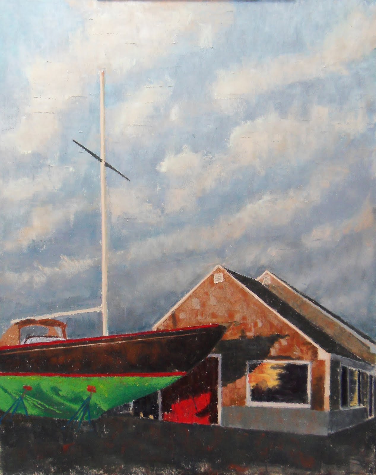
"7AM-Bridge Street Chatham"  I was planning on posting some images I shot during the process of completing this pastel painting. I'm going to explain my process and share some of my thoughts during each step of the painting. The description of each step will be below the image. Enjoy the post...it's going to be a long one!


I first started out back in January with a 16x20 piece of Kitty Wallace Sanded paper mounted on gator foam, giving me a solid, rigid surface to paint on. I used a selection of Terry Ludwig pastels to make this painting come to life. 

I started by lightly sketching the layout of my subject...the perspective and scale is key to this painting so I wanted to make sure I had everything in the right place. I really wanted to to a nice Amber colored under painting with this painting, but I guess I got lazy and just sort of blocked in quickly with my local color. Trying to focus on some of the darker values and colors I see right from the beginning.


I really started to focus on the sky here. In my opinion it was essential that I get the sky in a good place before I start putting in my clouds. I began to layer and layer colors into the sky...purples, greens, pinks...I did the same with the driveway under the boat. I wanted it to have more life than just blacktop so I gave it some nice maroons and oranges to give it a bit more life. I tried to stay really dark at this time also. Since the boat is one of the primary focal points, I started to layer the color on that area, not really focusing on form at this time. I haven't spent much time on the boat house at this time either.


I really picked up the pace a bit here...started to focus on the form of the boat, really pile the blues on the sky and started to give the boat house a little life.


Now that I felt the sky was in a good place, I began to quickly block in the clouds. I stayed a little lighter than I probably should have, but I was really just going for shape at this time. The perspective is key here also...the clouds really show movement and give the composition depth and capturing the angle was essential. 

I really went dark on the boat and other areas to get the rest of the painting to the same place. I over did it on the ground, at this point I lost a lot of the nice color I gave the hot top. My values on the house are not correct at this time, but for me I needed to see things a certain way before I moved on.

Very pleased at this stage.


In this picture I only focused on the clouds.  I set out to make them fluffy and give them the right color. If the color was not right I don't feel I would give you the early morning feeling that captured me so deeply when I photographed this landscape.

I went a little heavier on the three bottom clouds than I wanted to. I ended up darkening them up quite a bit. I really set out to make them feel far off in the distance...not sure if I accomplished it or not. I have notoriously struggled with clouds so I was very happy at where these were.

At this time I also began to go back and fourth with the sky colors again. That was very, very challenging because I'm a very messy painter...I had my pastels everywhere and quite honestly I couldn't for the life of me remember what pastels I used where, so the sky color got quite a few unexpected color additions at I moved forward.


OK, this is were it really started to breathe...The clouds were pretty much done at this point. I needed to warm them up a bit, so I began to add some creamy whites, some yellows and I also started to darken up the sky directly above the boat house too. I think I needed to get back some of the dark I lost to bring back some of the depth.

As you can see I really got into some of the details and really bring the form together on different parts of the painting. 

I began to darken up the right side of the boat house. I wanted that to be an afterthought and did not want  it to take your eye out of the painting. I focused on the shadow of the boat on the house and really tried to boost the amazing orange glow on the house. I focused shape of the shadow and the amazing reflection in the window also. I lightened up the color of the house and felt that was at a good place at this time so off to the boat! I added the white pinstripe, punched up the oranges and ambers, while keeping the glossy black color of the top of the hull. I focused on giving the bottom of the boat shape and inserted the stilts the boat was resting on.


Now the fun begins...I can't believe I didn't attempt to put the mast ropes in earlier regardless of what stage the painting was in...I added the crossbar you could see in the last image, but now adding the ropes was challenging and fun! I wanted them to have form and I wanted them to reflect the same orange light the rest of the subject was capturing. This is where the Terry Ludwig pastel is a HUGE help! Just pressing the corner of the pastel and following the angle down, varying pressure in different spots is what gives the ropes life and form even in the smallest, thinnest scale. I couldn't wait to do that. I was happy with the results. One of the ropes I had to fix...LOL the angle was WAAAYYY off!


In the final step, I lightened up the color of the hot top, added the line to lead you in a bit, lightened up the boat, fixed a little smudge in the orange window reflection...VOILA!

I hope you like the painting and enjoyed the post. I would love to hear your thoughts. Thanks for reading!